From NATS to Looker Studio - Visualize your Vehicle Telemetry
A step-by-step look at moving software-defined vehicle telemetry from edge to cloud with NATS and Google Cloud Bigtable
Hey there! I’m Peter, a Technical Marketing Engineer at Synadia.
Last week, we demonstrated how to create a vehicle telemetry streaming system using NATS and Google Bigtable, where we emulated a vehicle and streamed data in real time.
Today, we’re taking the next crucial step: visualizing this data by connecting BigQuery and Looker Studio to transform our raw telemetry into meaningful insights.
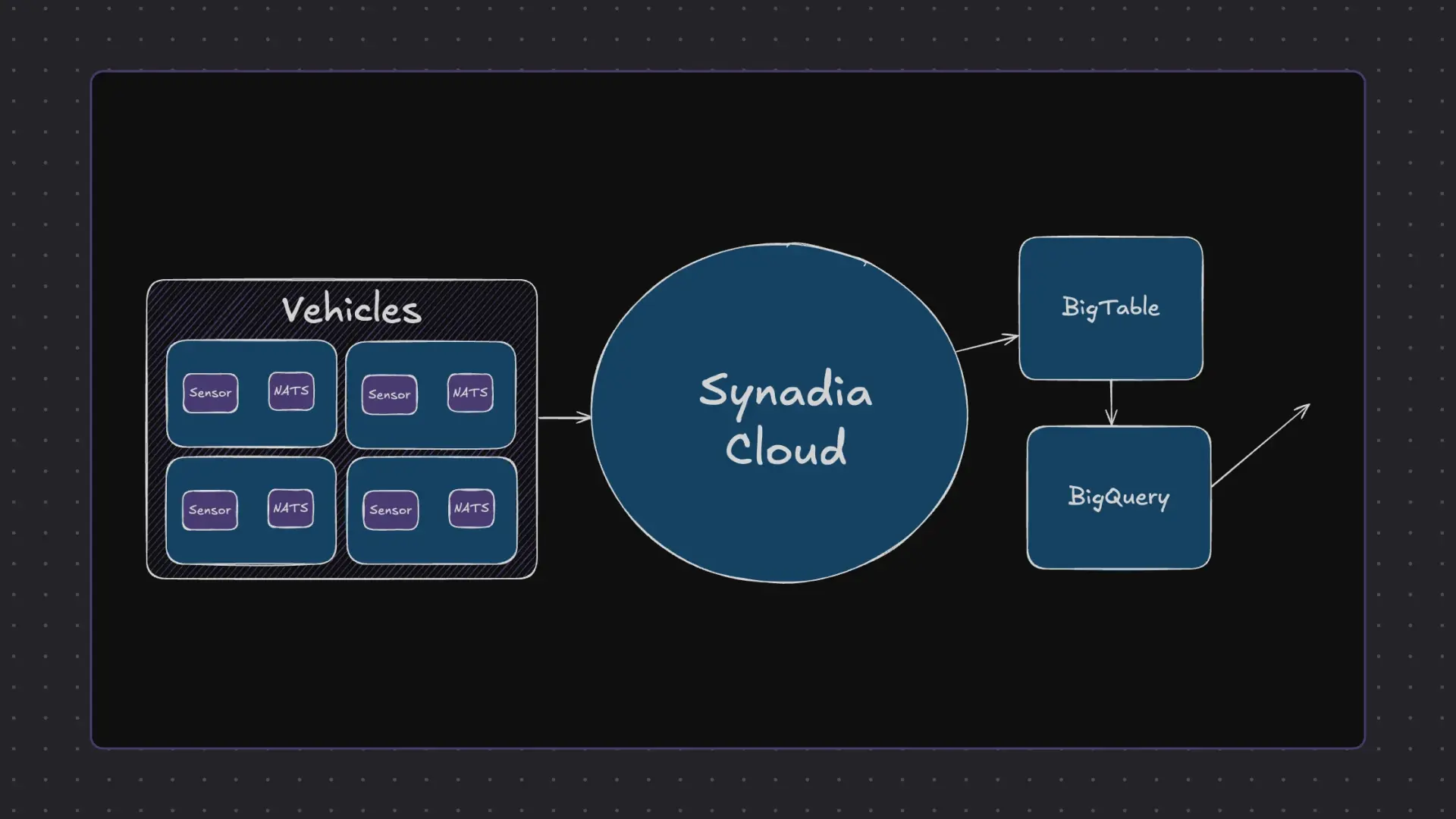
The Complete Architecture
Our enhanced demo features four racing cars sending sensor data through a comprehensive cloud pipeline:
- Data Collection: Four cars stream sensor data via NATS client to the cloud
- Data Storage: Synadia Cloud sends data to Google Bigtable
- Data Streaming: Change streams push updates to BigQuery
- Data Transformation: Custom views prepare data for visualization
- Data Visualization: Looker Studio displays real-time analytics
The Racing Scenario
For this demonstration, we’re simulating four cars racing across the salt flats of Utah, each generating continuous telemetry data.
This realistic scenario helps showcase how vehicle sensor data flows through our entire pipeline in real time.
Setting Up the Data Pipeline
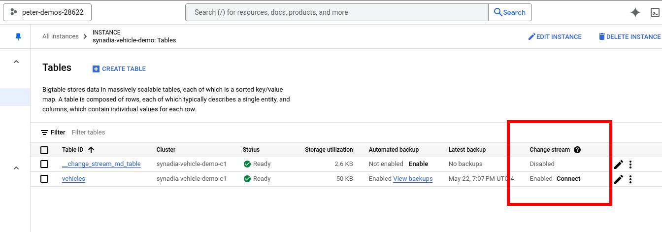
Step 1: Enabling Bigtable Change Streams
The key to getting data from Bigtable into our analytics tools is enabling a change stream on our table.
This feature monitors all changes made in Bigtable and automatically pushes those changes to BigQuery.
To set this up:
- Navigate to your Bigtable table
- Find the change stream column
- Click “Connect” and select “Create data flow job”
Step 2: Creating the BigQuery Dataset
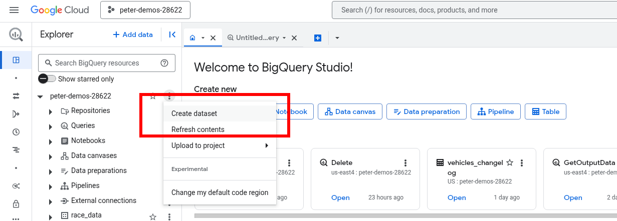
Before we can receive streaming data, we need to prepare BigQuery:
- Go to BigQuery and find your project
- Create a new dataset specifically for your Bigtable changes
- This dataset will serve as the destination for all streaming telemetry data
Step 3: Configuring the Data Flow Job
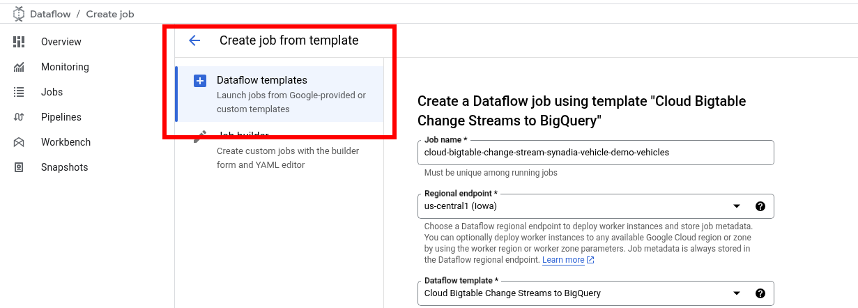
Use Google’s data flow template to create the streaming job:
- Set your job name and region
- Configure the target to use your newly created BigQuery dataset
- Enable the Data Flow API if prompted
This creates the bridge that continuously moves data from Bigtable into BigQuery as a change log.
Step 4: Transforming Data with ETL
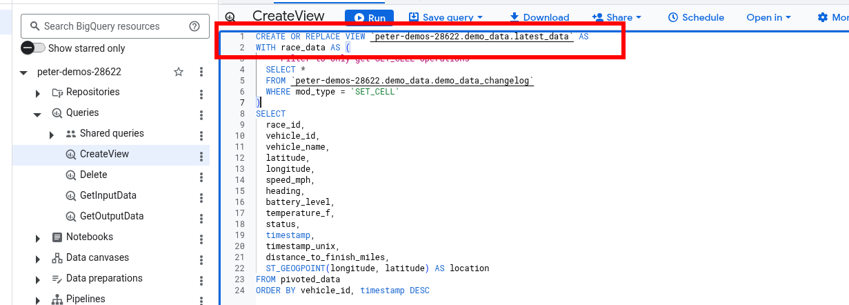
Raw change log data isn’t immediately useful for visualization. We need to perform ETL (Extract, Transform, Load) operations to make the data analytics-ready.
The solution is creating a custom view in BigQuery that:
- Processes the change log format
- Extracts relevant telemetry fields
- Structures data for optimal visualization
- Filters and aggregates as needed
This view becomes our clean, structured dataset that Looker Studio can easily consume.
Step 5: Building Real-Time Dashboards
Connecting Looker Studio
Setting up visualization is straightforward:
- Create a new report in Looker Studio
- Select BigQuery as your data source
- Choose your project, dataset, and the custom view you created
Creating Meaningful Charts
Our racing demo showcases several powerful visualization types:
Race Position Chart: A real-time view showing all four cars’ positions relative to the center point. During our test, the Bugatti emerged as the early leader, getting closest to the target during the initial timeframe.
Speed Over Time Analysis: A line chart displaying each vehicle’s speed throughout the race. The data clearly showed the Bugatti at higher speeds than the competition.
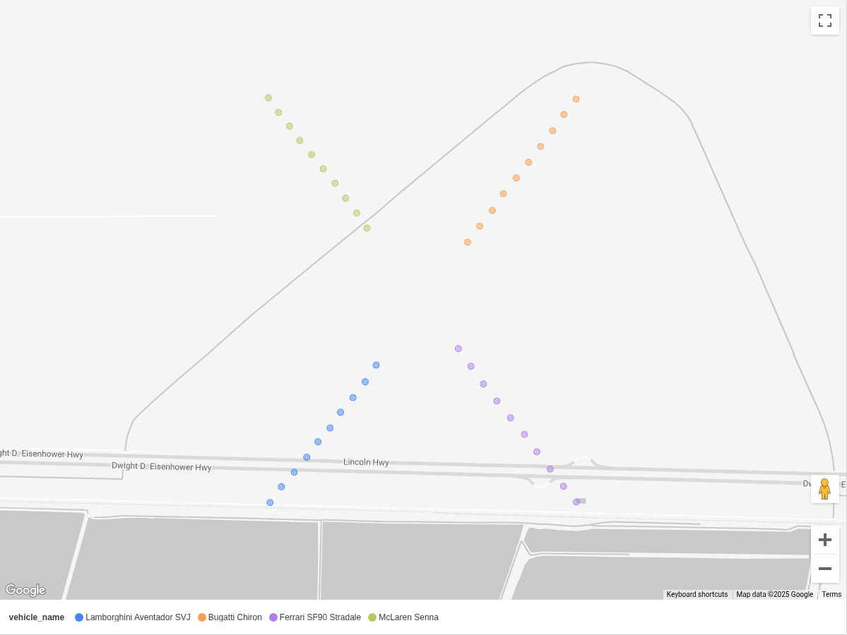
Geographic Visualization: By dropping location markers on Google Maps, we can visualize exactly where each vehicle traveled during the race.
Real-Time Data Refresh
One of Looker Studio’s most powerful features is automatic data refresh. We configured our dashboard to refresh every minute, allowing us to watch races unfold in near real-time.
The results were exciting: after waiting about a minute and refreshing, we discovered a new winner—the Ferrari had taken the lead!
This real-time capability demonstrates how quickly insights can change and why live data visualization is crucial for telemetry applications.
The Power of This Pipeline
This architecture creates a robust foundation for vehicle telemetry analysis:
- Speed: Data flows from vehicles to visualization in near real-time
- Scalability: Can handle multiple vehicles and high-frequency sensor data
- Flexibility: Easy to add new metrics, filters, and visualization types
- Reliability: Built on Google Cloud’s enterprise-grade infrastructure
The true nervous system powering this entire operation is Synadia Cloud, which delivered our telemetry data faster than the racing cars themselves could generate it.
Real-World Applications
While our demo uses racing cars for fun, this same pipeline architecture applies to:
- Fleet Management: Real-time monitoring of delivery vehicles, trucks, and service fleets
- Autonomous Vehicle Development: Processing sensor data from self-driving car tests
- Insurance Telematics: Usage-based insurance programs monitoring driving behavior
- Predictive Maintenance: Identifying vehicle issues before they cause breakdowns
- Smart City Traffic: Analyzing traffic patterns and optimizing urban mobility
Final Thoughts
This powerful pipeline combines the real-time messaging capabilities of NATS with Google Cloud’s robust data infrastructure.
The result is a system that can handle massive amounts of vehicle sensor data while providing instant insights through beautiful, interactive dashboards.
Whether you’re working with a single software-defined vehicle (SDV) or an entire fleet, this architecture provides the foundation for turning raw telemetry into actionable intelligence.
Ready to try it out for yourself? Create your telemetry proof of concept today with Synadia Cloud.
Related posts
All posts